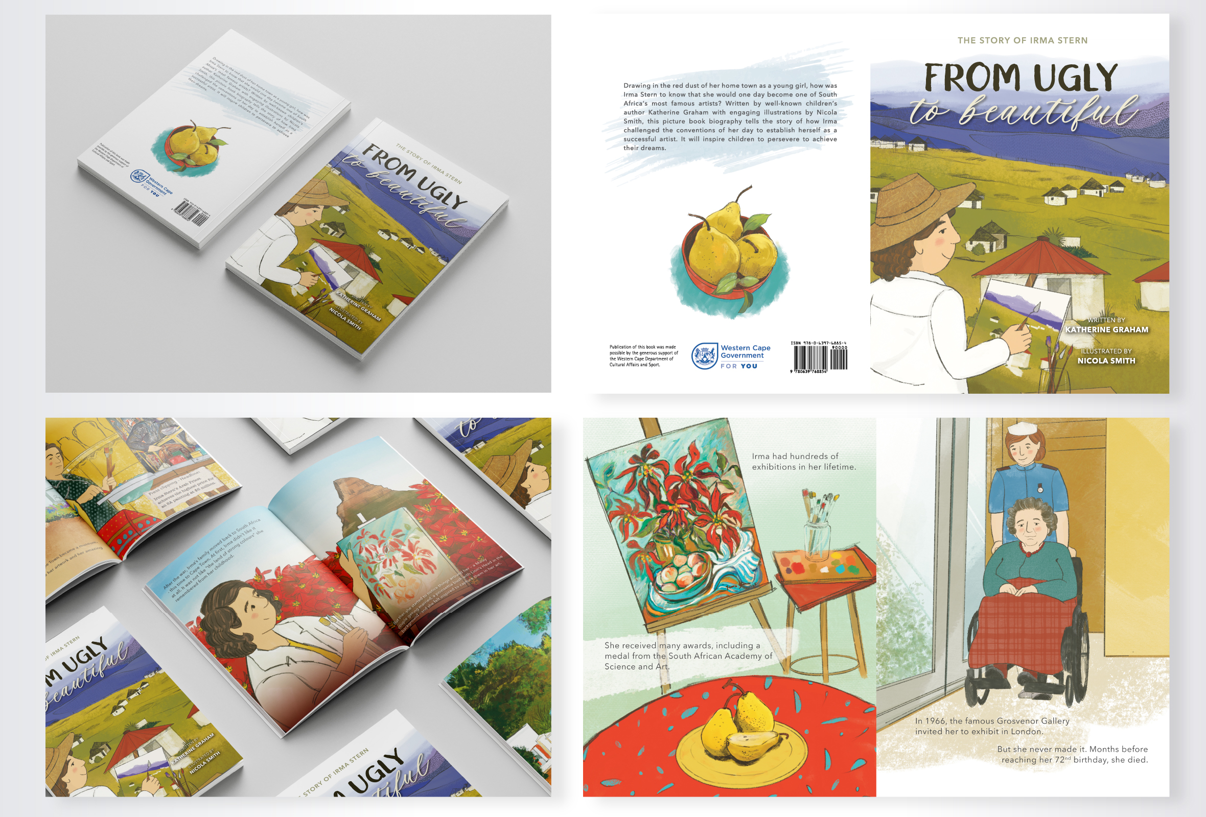
From Ugly to Beautiful
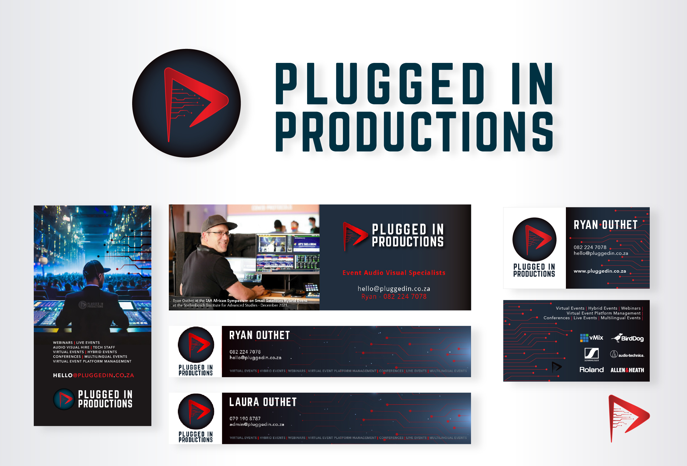
Plugged In Productions
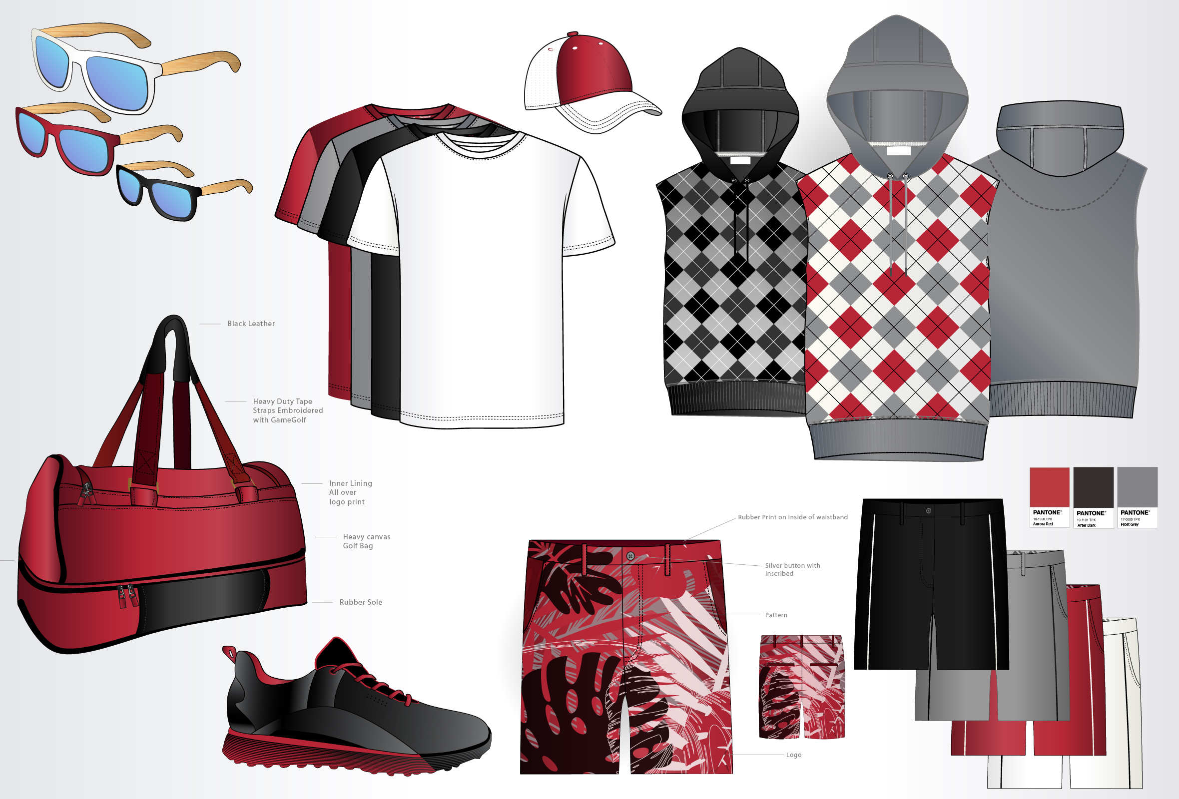
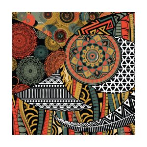
Textile Illustrations
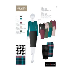
Conceptual renderings of clothing and other items developed for a sports company (name confidential).
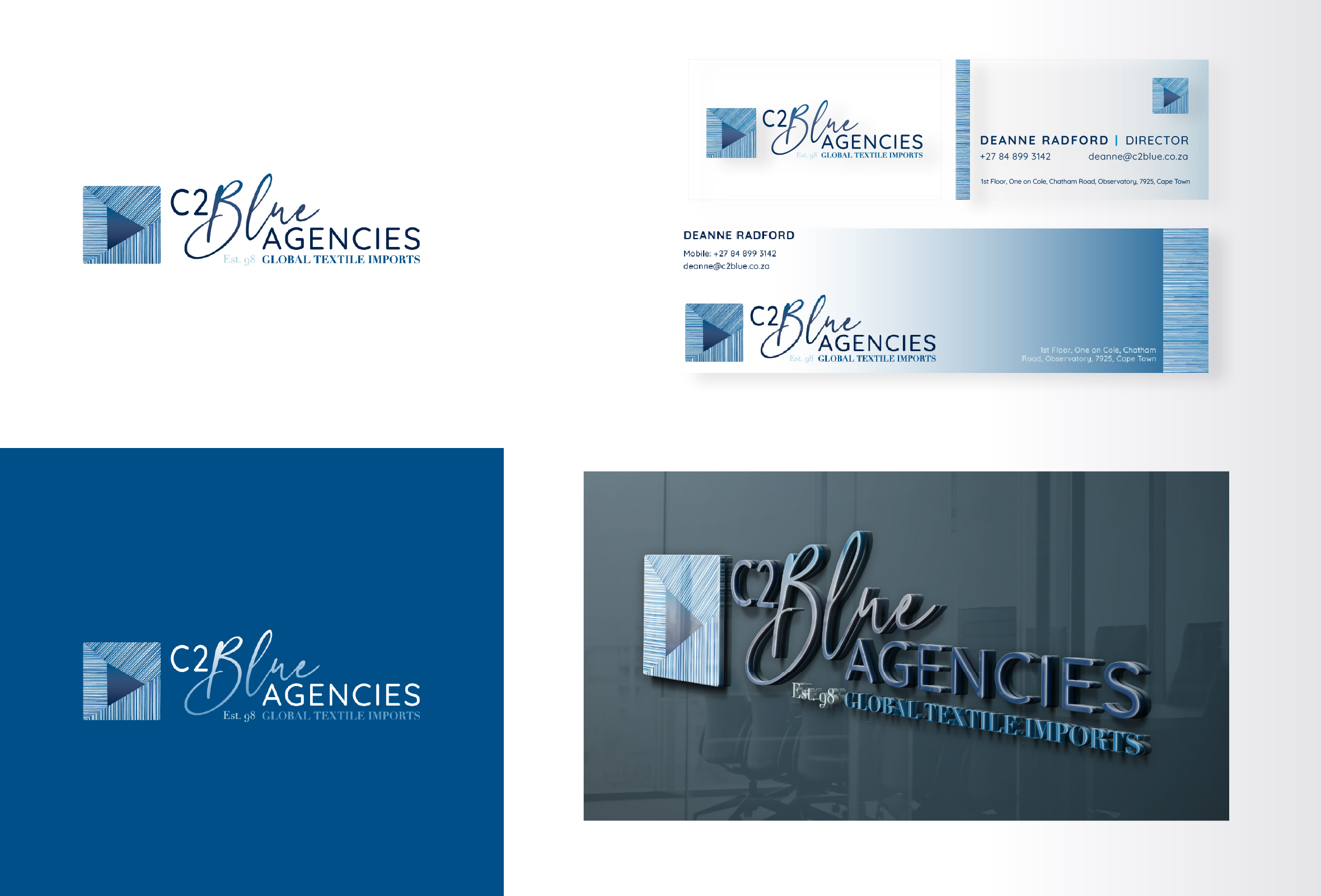
C2 Blue Agencies
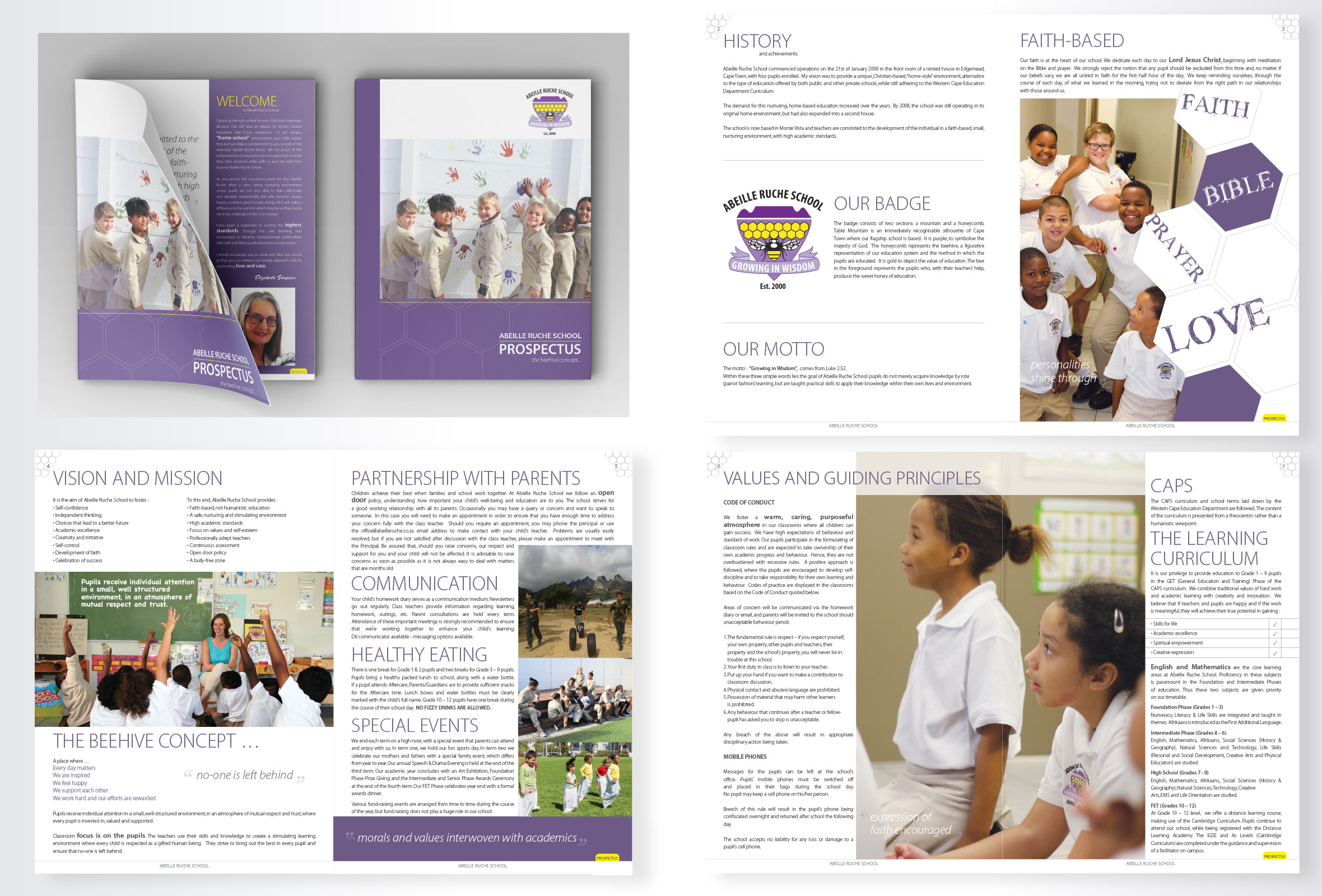
Abeille Ruche School
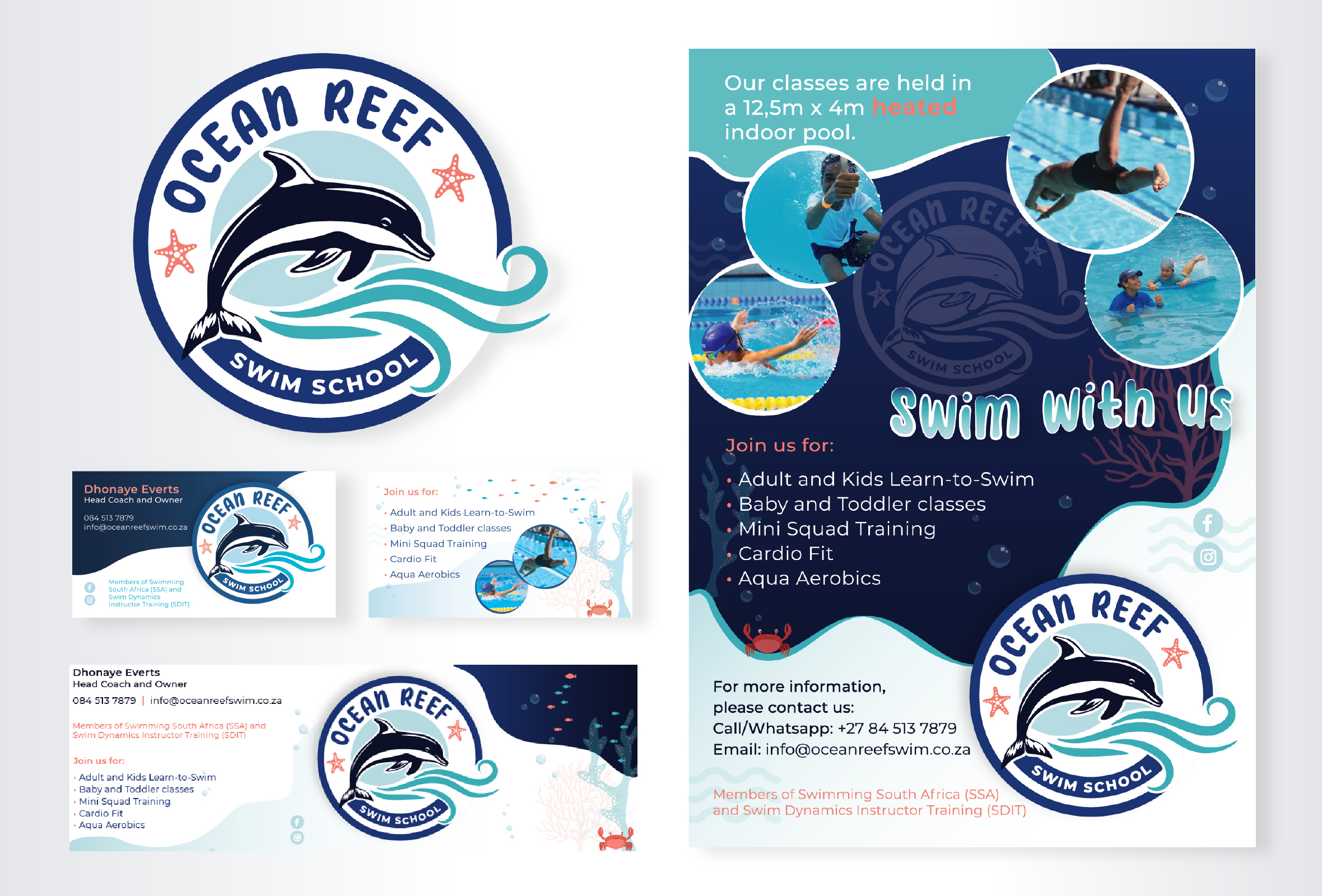
Ocean Reef Swim School

Journey with Jen
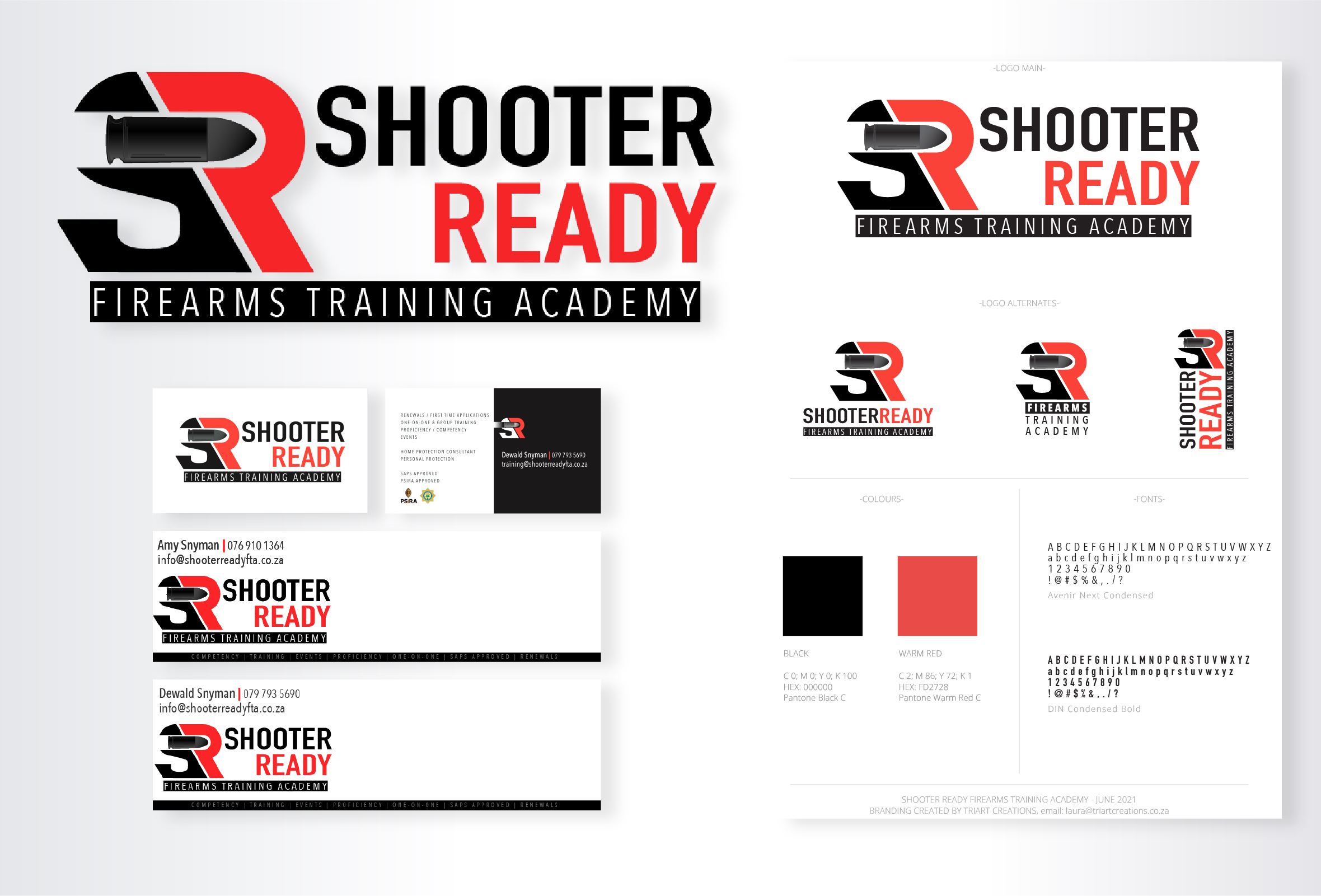
Shooter Ready Firearms Training Academy

OCD Solutions